Notes on Redesign
This month szafranek.net turns 14. That’s a respectful age for a website: Facebook, Twitter and YouTube didn’t exist when I launched this silly looking site back in 2003. It got its last major facelift in 2008, so by now it definitely looked venerable. Or at least old.
After I became a full time game programmer, szafranek.net suffered from neglect and served both as a reminder of my past, and a painful proof that I lost all credibility as a web developer. The final blow was delivered by Google, when in 2015 it started to penalize sites it considered not “mobile-friendly”.

Instead of following every reasonable person out there and moving my publication to Medium, Facebook or Twitter, I decided to keep the little personal homepage alive, like the year was 2003, not 2017. It’s more of a statement than a pragmatic decision, since handcrafting a redesign takes a huge amount of time, while convenient publishing platforms maintained by hundreds of well paid professionals are just a click away. Yet, I still believe that some of the most beautiful, wonderfully obscure and insightful things on the web can be found on personal websites. The dissolution of what was once called a “blogosphere” would be a terrible loss. Ironically, this sentiment seems to best expressed in a piece that was published on Medium.com.
It was the best of times, it was the worst of times
Since I’m no longer working as a web developer on a daily basis, it was interesting for me to go back and see how much has changed. I decided to focus on performance, and not turn a simple blog into a web app. In times where a blogging platform serves 2 MB of compressed JavaScript with every story, and checking out someone’s CV comes with a tax of 7 MB of scripts and 2 MB of CSS, my decision to not overengineer a WordPress blog made me feel very hip and quirky.
Why WordPress and not a static site generator? Nothing beats the speed of a well done static site. But, being a Luddite, I fancy the idea of allowing my visitors to search the site or leave a comment. I know, I’m still stuck in 2005, but I can’t help it.
As soon I settled on using plain CSS and standard JavaScript for minor progressive enhancements, it turned out that the experience is actually very pleasant and straightforward. Browsers these days are amazing. Technologies such as SVG, web fonts, flexbox, gradients, transitions and transforms are well supported across the board, and the rendering is very consistent and fast. A lot of the complexity of modern web development is self imposed.
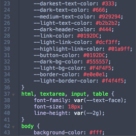
I didn’t use any CSS pre-processors either, because their only enticing feature (at least for me), CSS variables, has been present in every browser for years. Well, except for IE/Edge, which started to support it just this January. It’s reassuring that some things never change. To satisfy IE users I ended up using a CSS post-processor, because I wasn’t willing to sacrifice the convenience of CSS variables. But the overall time I had to spend to make my site work well in IE 11 was maybe 2 hours.
The biggest difference between the modern web and the old days is responsive design. But using good old-fashioned semantic markup and mobile-first approach makes it a breeze, given that all browsers worth mentioning support media queries. After all, any website with well written HTML already is mobile-friendly, so one only has to avoid writing layout rules that are too constraining.
While I did in fact spent an insane amount of time on this redesign, it mostly went where it should go: on creating high quality, retina-friendly graphics, polishing the layout and ensuring that the content looks and reads well; in other words, on design and not the futile fights with broken technology.
Now I can’t wait for another redesign. If I maintain my current cadence, it should be ready no later than by 2033!
Comments are closed