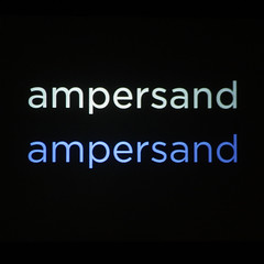
Ampersand 2011 – Web Typography Conference
Clearleft is a web agency, but it also seems like everybody there has to organize a conference at some point. Andy Budd is the spirit behind dConstruct, Jeremy Keith is one of the pillars of An Event Apart and Richard Rutter organized the first conference on web typography: Ampersand. The conference was scheduled on 17th June in Brighton.
Regular readers of my irregular blog know that I’m very keen on that subject. So I secured a ticket few minutes after the registration had started, despite not knowing what exactly to expect. Eventually, I didn’t come back disappointed.
From The Dark Side… Speak to me…
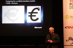
It’s hard to be more provocative than to start a conference for type nerds with a presentation by the creator of Comic Sans. Vincent Connare, in his own words, is not a type designer but a type engineer. He was working for Microsoft for several years and shared few stories from that period in his talk.
Connare was creating new glyphs for MS Serif in late 1980’s using a spreadsheet. Each cell represented either 0 or 1. 1’s were rendered as black pixels on screen – the most simple implementation of bitmap font possible. Few years later MS Serif was widespread and became default font in Windows 95. Before the launch of this operating system Steve Ballmer said that it looks too much like OS/2. As as result, Microsoft contracted Matthew Carter to design a new typeface that is now known as Tahoma. Eventually Tahoma didn’t replace MS Sans in Windows 95, but it happened later in Windows 2000 and XP. Roughly at the same time Carter designed Verdana and Georgia for Microsoft, two most successful web fonts. Apparently there are things we have to be grateful Mr Ballmer for.
In Windows 95 vector fonts were used not only for text, but also for user interface controls. TrueType font Marlett was in fact a collection of UI elements that scaled together with text.
Connare works now for Dalton Maag, an agency behind Ubuntu font and Nokia Pure. The latter was commissioned by Nokia for Symbian and MeeGo. The font is still under development to support growing character set and multiple devices. It comes in two variants: Nokia Pure Text and Nokia Pure Headline.
But it was really Comic Sans story that everybody had been waiting for. In 1995 Microsoft anticipated that computers will become popular at homes, and created Consumer Division. MS Bob was one of the flagship projects of that division. The goal was to make computers look easy for “moms and dads”, with the help of rich visual metaphors. For instance: talking dogs. Yes, the dog that barked its way into Windows XP search UI, appeared first in Microsoft Bob. This now infamous project was led by Melissa French (at the time Bill Gates’ girlfriend, now – Mrs Gates), so it had big traction at Microsoft. When Connare first saw the dog, it was speaking in Times New Roman. Clearly, nobody thought that typography is a part of application’s message. Connare realized that and designed the font that better conveyed goals of the project. His took inspiration from comic books, especially Watchmen. Eventually Bob was shipped with Times New Roman and Connare’s font was released later with Internet Explorer 1.0 and Microsoft Plus! pack.
It was not the only font Vincent Connare created at that time. In his own words: “I had nothing to do, so I designed Trebuchet and Comic Sans”.
Is he happy with his creation? While he realizes that Comic Sans is among the most abused typefaces in the world, it is also popular with novices, “moms” and “dads”. In other words: font matches the brief. And that’s what good design is about.
On Web Typography
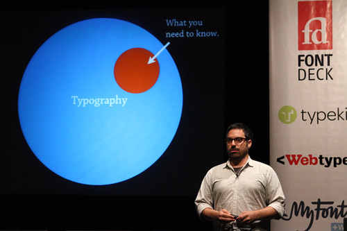
Jason Santa Maria started by declaring himself a font geek. The same passion was probably the single uniting factor for the audience ranging from professional type designers to web developers. Jason’s presentation was one of my favorites. It was delivered in a condensed, almost a tutorial-like manner. Using a Death Star diagram, Santa Maria demonstrated that typography is a broad subject. Fortunately, it’s possible to be effective after learning only part of it. The presentation was focused on one aspect of the craft: typeface selection.
Santa Maria broke it down into following:
-
Context
This is what makes typefaces good or bad – they are not born evil. Typeface can also enable re-contextualization. A perfect example is 100k.bigcartel.com, where a font similar to Didot brings a touch of class to a small DIY workshop photographs.
-
How to look at the type?
Type is about groups of letters. It’s better to look for workhorse typefaces than splashy display faces.
-
Reading & perception
Readers don’t see individual characters but rather a texture of text. Good typography is invisible. As an example Jason showed Stories & Novels. The website features a beautiful typography designed for long reading. That was a moment when I had my doubts: while the website is indeed gorgeous, it seems to be optimized for an “ideal reader”: focused, comfortable on her couch and having plenty of time for uninterrupted reading. I am afraid this type of reader is quickly disappearing in the world suffering from attention deficit disorder.
-
Considerations
According to Santa Maria, there are no rules in typography but only guiding principles. Here are some of his principles:
- Bigger is better. It’s preferable to err on the large side of things when it comes to font size.
- Ensure sufficient contrast.
- The longer the line, the more spacing it needs.
- The more color the typeface has, the more line height it needs.
Santa Maria illustrated his points by showing one of his recent designs, Bobulate.com. He also mentioned two JavaScript libraries that enable extra level of typographic control: Lettering.js and FitText.js. He used the former on Lost World’s Fairs website.
-
Methods for choosing typefaces:
- Consider dimensions, special features, internationalization, suitability for prolonged reading.
- Avoid ready-made typefaces with design baked-in.
- Build a personal palette.
- Research the history of typefaces.
- Look for associations between typeface and your content. Don’t be afraid of stereotypes.
- Look for typefaces designed together when selecting complementary font.
It’s hard to disagree with Santa Maria’s final conclusion that with all new possibilities in web typography, it is a wonderful time to be a designer.
Screen First
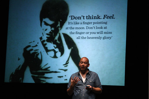
Jon Tan focused in his presentation on emotion and its expression through typography. With typefaces like Bello and Graveblade he illustrated how language is unnecessary for emotion: these typefaces convey emotions so strong, that they can suppress the meaning of words.
Tan contrasted Seth Godin’s view, that we should quiet our reptile brains, with the quote from Bruce Lee: “Don’t think. Feel.” When asking rhetorically “Would you like to be like Seth Godin or Bruce Lee?” he clearly ignored the fact, that Bruce Lee is dead.
The main part of the presentation included several examples of typography inseparably associated with brands. For instance, one of world’s first corporate typefaces designed by Peter Behrens for AEG, New Johnston – the typeface of London Tube and Victoria & Albert Museum logo by Alan Fletcher. He also brought Edenspiekermann website as an example of using typography alone to create distinctive design.
The last part of the talk touched the subject that apparently is all the rage right now: responsive design. Ethan Marcotte’s book was recommended more than once throughout the day. As Jon Tan put it: design places, not postcards. Websites should be dynamic and adaptable. It’s funny to hear essentially the same mantra being repeated under different names for the last 10 years by people who understand the web, yet still see new designs that treat screen as a fixed sheet of paper. It’s less and less likely that our websites will be viewed on 1024×768 computer screen. While most designers don’t have to deal with screens similar to the one mounted on Dallas Cowboys stadium, resolution range of current devices is staggering.
Putting the ‘Fonts’ into Webfonts
Lots of people I talked to were looking forward to Jonathan Hoefler’s talk. In fact, it was really good. Hoefler introduced himself as the Chief Philosophical Officer of Hoefler & Frere-Jones studio. He and Tobias Frere-Jones enjoy well deserved celebrity status thanks to designs like Gotham (the “Obama font”) and Hoefler Text.
The talk stressed the importance of design systems. An idea can be transformed into a form with such a system in place or without it. However, in the latter case the form is confused with the idea, resulting in products like static Flash websites for restaurants: inflexible, static and effectively – dead. With design system, the form comes out naturally and is easier to extend. A good example are Books Apart. Their common visual characteristics (grid, typography) create extendable system.
The lack of design system can translate into typography realm as the difference between highly functional and hyper expressive fonts. Can a typeface be both functional and expressive? “This is what we do”, says Hoefler.
The presentation resolved around the work done at Hoefler & Frere-Jones, with a lot of stress on environmental awareness – consideration for the medium, be it print or screen. A good example was Retina typeface commissioned by The Wall Street Journal for its stock listings. Such listings are set in very small type, which results in too much ink between stems and bars. To counter this, Retina is unusually thin in such crucial places. This would look strangely at larger sizes, but fits perfectly tiny and dense print. Retina glyphs are as different from each other as possible, to work well with unusual combinations of characters, often present in stock listings.
Type design is for the screen is no easier. Especially since there’s no such thing as The Screen. Hoefler showed that the number of parameters affecting the look of fonts exceeds a dozen and only few of them can be controlled by font designer. And then there comesCSS, which allows very limited control over type. For instance, some families created by H&F-J feature over 40000 glyphs, including swashes and ligatures. However, they can’t be accessed on the web. In fact, only 7.3% of their glyph library is now supported by CSS! While the progress in web typography during the last 4 years has been incredible, this percentage is mind-boggling. Nevertheless, Hoefler announced that all their typefaces will be available as web fonts – the move was applauded by the audience. The transition wasn’t a trivial process, as some fonts had to be manually adjusted for screen.
I was happy to hear some details of daily work of type designers. It’s incredibly meticulous, since families like Gotham have tens of thousands of characters. Manually hinted. With 210 steps of QA per font style. Awww…
Adventures in Letterdrawing for Crude Media, & Co
Afternoon session started with the talk by David Berlow, a co-founder (with Roger Black) of Font Bureau. He shared his story of the struggle with screen media, from his time at Linotype in 1979, through Bitstream in 1980’s, to work done on Bloomberg Terminals and Palm Pre in 2008.
The presentation was given in a tired and snarky manner of a veteran who’s “been there, done that”. My notes from this talk are sparse. You can also blame lunch break, if you want.
The Future of CSS Typography
John Daggett of Mozilla Japan gave the most technical talk of the conference. He started by showing non-obvious capabilities of CSS2 rules, namely font-family, font-weight and @font-face. Some of these included typeface selection dependent on Unicode character range, algorithm for selecting face with font-family and cross-domain access control for web fonts.
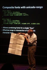
Next, he showed new features coming in CSS3 Fonts Module. John is the editor of this module, so he’s certainly the right person to talk about it. The standard will define control over OpenType features, like ligatures, lining and old-style figure selection, fractions and language-specific variants.
The presentation was dense with content and I strongly recommend going through John’s annotated slides to anybody interested in CSS typography.
More Meaningful Typography
The talk by Tim Brown of Typekit was focused on designing page “content out”. This term was coined by Mark Boulton to describe design process where type is basic building block. In this approach em box – CSS content area of a font – becomes starting point for modular scale, and thus defines page dimensions and font sizes. This stands in opposition to more common “canvas in” workflow, where designer starts with the grid and then fills boxes with content.
The process starts with selection of ideal font size and ratio. The latter could be 1:1.618 (the golden ratio), 1:5, 4:5… There is really a lot of options to choose from. It is reasonable to pick a second dimension that will provide more values to the scale and extra flexibility. It could be default photo size, width of a key visual or other measurement meaningful to the page. With two numbers and a ratio the scale can be computed. Brown created Modular Scale Calculator, a simple tool that makes the process automatic.
The idea looks interesting and Brown explained it in detail in his article for A List Apart.
Having more time than the subject actually required, Brown listed several examples of good typography and a quote that justified his concept in a somehow grandiose way:
Feelings have to mature into knowledge
I guess quoting Jan Tschichold never hurts in a conversation about typography.
Outing the Mind: Designing for the Chaos
One could argue that Mark Boulton’s talk was inflated with form at the cost of substance, but I enjoyed it immensely. It was entertaining and perfectly appropriate for the end of the day.
First, he showed the best definition of entropy I have ever seen and the most concise description of designers’ work. Photos show it better than I could describe it.
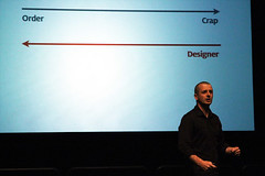
Boulton demonstrated how people over centuries have always tried to introduce order into the chaos that surrounds us. He used examples seemingly remote to the subject of design, like the invention of container ship by Malcolm McLean in 1956 or Large Hydron Collider in Switzerland. What such things have in common is that they abstract some problems, so we don’t have to think about them. Or, in the words of Andy Clark:
Our brains make the world smart, so we can be dumb in peace
In the realm of design similar role is fulfilled by systems like grids. This leads to “canvas in” approach, where rigid rules dictates everything on the page. Boulton’s main point was to embrace the opposite and design for the chaos. Or: acknowledge that the world is full of crap and design for it!
Mark summarized his advice in three points:
- Know your content!
- Derive your layout from the content.
- Design small “bits” first.
This inevitably led to yet another plug for Ethan Marcotte’s Responsive Web Design book, as embracing chaotic world of multiple devices is central to responsive design. Boulton made interesting remark, that when designing for different platforms we can’t just make three or more layouts instead of one. To be truly effective, it’s necessary to think what happens between different resolutions.
Obviously, this idea is not new and Mark encouraged everybody who hasn’t done it yet to read A List Apart article A Dao of Web Design, where John Allsopp described the principles of adaptable design as long as 11 years ago…
Wait, there was more!
The conference was a blast. If you managed to read that far, you will probably agree that it was full of wonderful content for type geeks. A great follow-up was a typographic tour of Brighton the next day, guided by Phil Baines. Add some really cool people (shouts to Ben Mitchell, Caz Mockett, Panos Vassiliou of Parachute and Cristina Chacón Rodríguez) and you will get a perfect mix. I hope ClearLeft will organize another installment next year.
On my way back from Brighton I was paying much more attention to lettering around me than usual. In the words of Jason Santa Maria, When you learn about typography, you can’t unsee it.
Brush
Wow, that was a comprehensive report my friend. I don’t understand typography the way you do but know when i see a good one :) Diving into such different and niche “scene” might be interesting on many fronts.