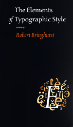
The Elements of Typographic Style – Book Review
Last year I was diagnosed with typophilia. This disease-like affection for typography was fostered by reading The Elements of Typographic Style by Robert Bringhurst. The book has changed the way I look at books, signage and web pages. It’s also the very reason this website has been designed the way it has.

Starting from the first touch, the book is a pleasure to hold and browse through. It doesn’t use color, photographs and ornamentation. But it’d been very carefully set in type and illustrates the principles it preaches. It definitely looks like a book on typography should look: modestly yet stylish.
These two qualities also apply to the language of the book. Robert Bringhurst, apart from being a typographer, is also a writer and poet. And it’s visible through the book. The language is rich and careful, but far from being pretentious. After all, it’s a textbook. There are some spots, though, where the personal views of the author leak through, spicing up the prose with delightful passages like this one:
[Text figures] are basic parts of typographic speech, and they are a sign of civilization: a sign that dollars are not really twice as important as ideas, and numbers are not afraid to consort on equal footing with words.
Chapter 3, Harmony & Counterpoint
Respect for reader and the subject are clearly visible through the text. And this is, in my opinion, the single most important characteristic of a good book. Be aware that the book requires study rather than skimming-through. I must admit it took me 3 months to get through its 400 pages (I didn’t skip even the bibliography). It can be appreciated only if you pay attention to details and appreciate the topic as much as the author does. Otherwise it may just bore you.
The content of The Elements of Typographic Style will help you to understand the typography inside-out. Bringhurst covers all the aspects of using type: from details of individual letters to page grids. He describes the usage of analphabetic symbols, rules of composition and criteria for type selection.
One of the most interesting chapters in the book is dedicated to evolution of type during the last 500 years. It let me understand the origin and character of some popular typefaces. It’s truly rewarding to be able to spot and describe differences between Renaissance and Neoclassical letterforms.
Significant part of the book is dedicated to descriptions of individual typefaces. While this catalog is broad, it is still a subjective selection of designs that Mr Bringhurst finds the most interesting. It means that some popular typefaces, like Din, Times, Verdana or Trajan, just didn’t make it there.
The book is oblivious to the web. Though I have read the third revision (from 2005), it focuses on print and doesn’t provide information specific for screen media.
Still, I strongly believe that The Elements of Typographic Style taught me more about web design than any other book. The web has its own peculiarities, like low screen resolution and shameful font selection. But these are few comparing to the vast amount of information that can be learned and applied from Bringhurst’s book. I agree with the view that web design is 95% typography. So if you’re a web designer, this is THE book to read. But be aware: it may turn you into typophiliac as it did to me.
PS. The book is also available in Polish.
szczyp
lovely looking blog; the book seems very interesting