Font Smoothing Explained
Attention to detail is essential for good design. That’s why designers spend huge amounts of time polishing borders, textures and other visuals. Arguably the most important area of web design is typography. It’s also the area where a designer’s control over details is surprisingly limited.
This article discusses font smoothing, a feature that significantly affects the final look of a type on screen. Font smoothing produces very different results across operating systems and browsers. The goal of this article is to explain these differences and provide designers with practical hints on how to deal with these differences.
What is font smoothing?
Anything on the screen, including type, is displayed using pixels. The simplest approach to display type is to use pixels of solid color to represent glyphs (visual characters). This method is easiest to implement and fastest to compute. However, on current computer displays pixels are rather big objects. Typical screens nowadays have 96 DPI (dots per inch) resolution, which is extremely low when compared with high-quality printers, where resolution of 1600 DPI is normal.
Low resolution results in rather unpleasant “jagging” or “pixelation”. Another consequence of low resolution is that small glyphs of different typefaces are virtually indistinguishable as they are constructed from very few pixels. To overcome these problems, several font smoothing techniques were invented.
Antialiasing
The first method is antialiasing. It uses partial opacity to emulate smooth curves of the glyphs. As the final result, the shape of glyphs is more true to the type’s design. Additionally to antialiasing, decent screen fonts use hinting to better match glyph shape to pixel grid. A properly hinted font looks much better on the screen than font rendered with default pixel positioning. More information on hinting can be found on Wikipedia.
Antialiasing has its own problems, inherent to low resolution of computer displays. Most notably, small text looks blurry, as shown on a figure 3. For this reason antialiasing is not used for small font sizes on both Mac OS X and Windows.
Subpixel rendering
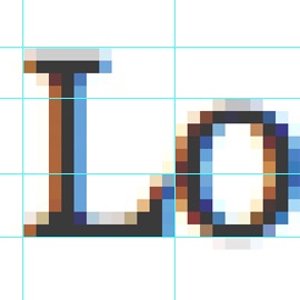
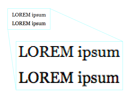
An obscure feature of LCD displays allows for more sophisticated font smoothing. Each pixel on LCD screen consists of 3 horizontally arranged subpixels. These are responsible for rendering red, green and blue components of any color pixel. Software capable of using subpixels can effectively emulate horizontal resolution that is 3 times bigger than normal resolution, eg. 3072×768 instead of 1024×768. Subpixels are small enough to be indistinguishable to a human eye, but can be identified with a magnifying glass, as shown on figure 4 (photo credit: Wojciech Bednarski).
A technique called subpixel rendering uses these small “subpixels” to achieve more precise font smoothing. The result is good enough to be also used for smaller font sizes, unlike standard antialiasing. Windows’s ClearType and OSX’s Quartz are two different implementations of subpixel rendering. It’s easy to recognize subpixel rendering: when apparently black text is zoomed, it turns out to consist of colorful pixels, as illustrated on figure 5.
What people use?
Text looks very different, depending on whether subpixel rendering, standard antialiasing or no smoothing at all is used. Unfortunately, different operating systems and even browsers have different smoothing settings. It all makes the work of a web designer much harder. One needs to take into account at least the most popular configurations used by site visitors.
Mac OS X
On Macs, the situation is relatively simple. Rendering layer of OSX, Quartz, uses subpixel rendering, as ClearType does. However, the results are strikingly different. Fonts on Macs seem to be more “full” and closer to the original designs of typefaces. Windows users can check OSX rendering by downloading Safari, which has its own font rendering engine, similar to the one used on Macs.
However, many Windows users complain that Mac’s/Safari’s rendering is inferior to Windows’: that text is blurred and harder to read on a screen. It’s not surprising that Mac users argue for the opposite. Joel Spolsky discussed these differences in his article Font smoothing, anti-aliasing, and sub-pixel rendering.
Windows XP
By default, Windows versions prior to and including XP use no antialiasing at all, producing sharp, but jagged glyphs. The effect is especially troubling for bigger font sizes. Starting from Windows 95 users could enable standard antialiasing. In Windows XP it’s on by default and users can also choose ClearType, Microsoft’s implementation of subpixel rendering. However, this setting is well hidden, and there are no definite statistics on font smoothing usage.
Windows Vista
Starting from Windows Vista, ClearType is on by default, though users could still opt for disabling it in favor of standard antialiasing or no font smoothing at all. Again, there are no statistics on that, so web designers can only assume that the majority of users will follow the default setting.
Web browsers
Traditionally, web browsers had been using operating system’s settings. Internet Explorer 7 was the first browser to change that. By default it has ClearType turned on, regardless of Windows settings. To Windows XP users the text will look very different, depending on whether they use IE7 or another browser. Users of IE7 (and IE8 for that matter) can disable ClearType in their browser settings.
Safari for Windows is the second browser that uses its own smoothing settings, but it’s different to IE’s. Safari produces the glyphs in a manner similar to Mac OS X, with results that are very different to methods used by Windows.
All the other browsers (most notably: Firefox on Windows) respects their operating system’s settings for font smoothing.
Photoshop
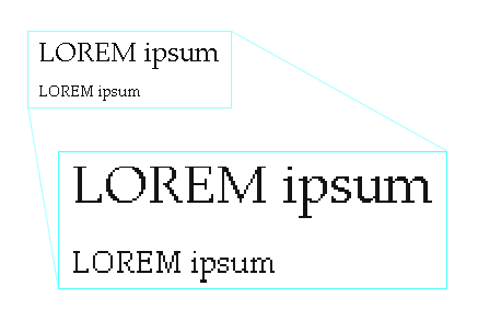
Adobe Photoshop can be used only for a basic check of how the final text will look like. As for version CS2, Photoshop doesn’t offer subpixel rendering, so it can’t be used to compare with Mac OS X’s Quartz or ClearType. It offers Smooth setting which is an approximation of Window’s standard antialiasing. Yet the text looks significantly worse, apparently due to inferior hinting (see figure 2).
As you can see, the number of different combinations is significant. The table below summarizes the most common settings.
| Windows XP | IE7, IE8 | Subpixel rendering (ClearType) |
|---|---|---|
| Safari | Subpixel rendering | |
| Other browsers | Standard antialiasing | |
| Win Vista, Win 7 | Subpixel rendering (ClearType) | |
| Mac OS X | Subpixel rendering (Quartz) | |
Conclusions
Unfortunately, a designer cannot ensure that users will see HTML text exactly as designed. Rendering the whole page as an image or Flash file is not a sensible alternative due to performance, usability and accessibility concerns. What, then, can a designer do to ensure maximum legibility and a good look of a type?
- Accept the reality. Right now there’s no way to tell what settings your users have. Most likely, they have subpixel rendering on Mac OS X, no antialiasing at all on Windows XP with IE6 or Firefox, and ClearType in IE7, IE8 or Vista, but you can’t be 100% sure. Needless to say, a website will look very different across all these environments.
- Assume the worst. When designing the page in Photoshop, check how does it looks without any text smoothing at all and with Smooth setting applied. Bear in mind that Smooth setting is not equal to standard antialiasing and there’s no Photoshop equivalent whatsoever to subpixel rendering. As for 2008, no smoothing at all is a very prevalent option out there, as it’s used by IE6 and Firefox on Windows XP with default settings.
- Use fonts designed for a screen. So called web fonts were designed with the screen in mind and its low-resolution pixel grid. The list includes Arial, Courier New, Georgia, Times New Roman and Verdana. While these fonts may look like over-exploited cliché and you may prefer Helvetica over Arial (like me), they’re also the simplest way to achieve legibility for the widest audience. The old rule still holds: when in doubt, use Verdana.
- Beware of big type. Big font sizes are especially harmed by pixelation when font smoothing is disabled. If your audience is likely to use this setting, avoid big type.
- Test. Make sure the page is legible with font smoothing turned off, standard antialiasing (Windows) and subpixel rendering (ClearType on Windows, Quartz on Mac OS X). Change the typeface or its size when legibility is a problem. If you use Windows, you can check Mac rendering with Safari. On Mac, you will need to install Windows XP or Vista. If you’re a web developer, you probably already did so.
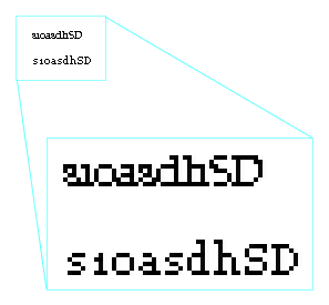
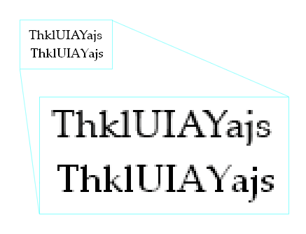
Figure 6. ClearType font Constantia vs. Georgia, both at 10px size, without font smoothing - Beware of ClearType fonts. Windows Vista and MS Office 2007 features a collection of fonts designed especially for use with ClearType: Constantia, Corbel, Calibri, Cambria, Candara and Consolas. Apart from sharing unfortunate naming, they can be barely readable when font smoothing is disabled (figure 6). While they may become a long-awaited refreshment to web fonts, one should avoid them if subpixel rendering is not ensured (eg. on Firefox on Windows XP).
- If all fails, use JavaScript sniffing. There’s a method to detect with JavaScript if the browser is using some form of font smoothing. It has some limitations, e.g. doesn’t distinguish between basic antialiasing and subpixel rendering. But it could be used to serve different fonts depending on user’s settings.
- Wait for a future. CSS3 includes
font-smoothproperty, which will allow designers to control text smoothing. Unfortunately, as for 2008, no browser supports this property. Keep in mind that the whole issue may become irrelevant before this CSS property will be implemented. Computer displays are being constantly improved and one day they should have enough DPI’s to display type in a perfectly legible way without smart tricks.
Of course one can just forget about all this and move on. However, as for now, consider legibility before you condemn Arial or Verdana.
Comments are closed