Designing Interaction at natrasie.pl
In August 2008 I joined four of my friends, Tomek, Bartek, Michał and Sebastian, in a quest to create a cool new web application. For every one us it was a side project, done after our daily jobs. However, we were determined to make it successful and for it to bring us fame, fortune and glory. One year later… well, the glory is here. The rest should now follow easily.
Our intended audience are the travelers. We focused on the tourists and day-trippers, though diehard globetrotters should enjoy the website as well. We decided to make the trip experience the central point to the application. The website is supposed to capture that experience and let our users share it with others. The other important goal is to give travel ideas to people who are considering making a journey.
Taking all that into account, we decided to choose the name and the tagline: natrasie.pl – Wrażenia z podróży. In Polish it means something like On the road – Trip impressions.
I had a few roles in the project. I was responsible for interaction design, coordinating the work of the graphic designer and writing the front-end code. It was the first time I worked in a startup-like setup so I’ve learned a few lessons, especially in the area of interaction design.
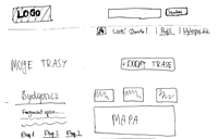
When I joined the team, the guys already had some idea of what the application should offer. In order to clarify the functionality and ensure a common vision, I created paper prototypes covering each screen of the application. The prototypes were hand drawn and very low-fi. My complete lack of drawing skills certainly helped to avoid unnecessary details. However, even such rough prototypes were a great help. Most of the interaction design decisions were made during the discussions based on these prototypes. Although it’s not possible to find and resolve every problem during this early phase, we achieved a common agreement on the functionality. Thus we had much less to discuss in the later phases of the project.

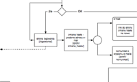
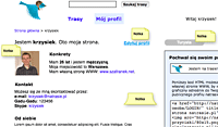
At the same time I’ve found Helena Pryłowska (aka Helen), a graphic designer who eventually created a brilliant visual identity and graphic design for our website. Apart from a formal design brief, I provided her with a second set of prototypes. This time the prototypes were much more detailed and polished. I used Omni Graffle as the drawing tool. I quickly fell in love with it. It is amazingly easy to use, has a big set of freely available stencils and allows you to create very different kinds of drawings. I used Graffle to create a site overview (using Jesse James Garrett’s visual vocabulary) and mockups of each page.

Prototypes created with Omni Graffle, unlike the paper ones, contained all the elements that made their way to the final design. Before passing the mockups to the designer, we had the final internal discussion about each page. While most crucial decisions were made during the paper prototyping phase, detailed mockups helped to clarify a lot of details related to content and application behavior.

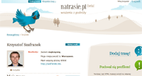
The mockups also made the work of the graphic designer easier, as she could focus on the visuals instead of guessing what should be on the page. It limited the number of iterations we had on graphic design. For most screens the first version from Helen was accepted, and only two or three times there was a need for significant amendments.
It’s clear that the process we followed was quite “heavy”: it involved a lot of prototyping before we dived into the code. Because I had limited time to work on the project (approximately 10 hours each week) and each mockup was discussed with both the team and the graphic designer, it took us 4 months to go from the vague vision to the finished screens ready for the implementation.

However, it paid. First, the mockups helped to ensure effective collaboration with the designer. Secondly, when we eventually started to code, it went very smoothly and without a need to change the design significantly. All important decisions were already discussed and made, so we could spend the next few months translating this into the code. I also believe it helped to achieve a good level of quality from the very beginning, removing a need to rewrite huge parts of the application the very next day after it went live.
Of course no real project comes without blunders. The single most important lesson I learned? Design is all about the communication. Interaction design is no exception. This apparently obvious fact cannot be overstated.
The interaction designer is responsible for achieving a common understanding of the application within the team of developers and graphic designers. The prototypes themselves help a lot, but the way of presenting them to the rest of the team also matters. Initially I made a mistake of not explaining the prototypes sufficiently. During the process I eventually worked out a more effective way of presenting them.
A day before face-to-face discussion on mockups I sent them to the rest of team. In the e-mail I explained:
- the goals of the page
- design challenges it entails
- the rationale behind my design decisions.
It takes time to write such an explanation but it really helped us to have effective discussions the next day. Skipping this part can bring a lot of misunderstandings.
Tip: always write down the results of a discussion. We wrote minutes from every meeting. Later on we often referred to these minutes and avoided unnecessary arguments about established decisions.
Unless your team mates don’t care about the project, they will probably disagree with you once in a while. How to handle this? First, ensure you have common goals for your product and want to reach the same users. A useful technique to achieve this is to use personas. The designer not only needs to create personas, but to make sure that everybody in the team understands them and believes they represent real target users. The lack of buy-in for the personas in the beginning leads to the pointless discussions starting with “Being a user myself, I believe that…”
The other solution to the last problem is the user testing. Unfortunately, it’s also a first victim of the tight timelines. I strongly believe in the value of prototype testing, so the lack of it in natrasie.pl is almost like a personal failure. Because the prototyping phase took so long anyway, I decided to skip it.
It was a direct consequence of our team structure: there were four Java developers and one interaction designer, also responsible for the front-end code. It was no surprise that I quickly became a bottleneck. While the other guys were eager to finally put their hands on the code, I was still struggling with the mockups. The lesson? The interaction designer should start working as soon as possible. Otherwise the developers can become (understandably) frustrated by the lack of work in the early phase.
Fortunately they had managed to cope with me and we finally deployed our first public beta on 12th May 2008. It quickly became apparent that it’s just the beginning of the real work: bug fixing, introducing new features and marketing. Though I had finished my work on the project at the end of June to work on other ventures, Bartek, Michał, Sebastian and Tomek bravely continue their journey to make the best web app ever. Good luck, guys, and thanks for all the fish :).
h
kind of waiting for new design:)
Gify
Niezłe designy :)