@media 2008
Another spring, another @media conference. This year’s London installment was accompanied by the moody website with a promising list of speakers. The content was pleasing enough to deserve over ten kilobytes of pure text. Fellow reader, be warned.
“Designing Our Way Through Data” by Jeffrey Veen
Two years ago Jeffrey was presenting at @media 2006 as a newly hired Google employee. Now he had just quit Google. Apparently, being an ex-Googler is as hip as being a Googler two years ago.
In his talk, Veen demonstrated some of the challenges faced by designers of modern, data-intense applications. He used a few examples to demonstrate clever solutions to some old problems. The examples included:
- Harry Beck’s Tube map. By hiding geographical relationships, the map puts focus on what’s more important for the travelers: how to get from one station to another.
- Charles Minard’s graph of Napoleon’s march to Moscow. This brilliant illustration shows at least five dimensions of information.
- John Snow’s map of cholera epidemic in Soho. Visualizing the dry data had helped to find and eliminate the source of the disease. It was probably the first time when real, scientific data was the main justification for a political decision. One could argue if it isn’t still a rare case.

Being a fan of Edward Tufte myself, I was glad to see that Veen recommended Tufte’s books and used them as a source. He also showed how easy it is to make mistake of oversimplification. Modern presentation tools like Keynote or PowerPoint make it easy to “posterize” the data and obscure it with fancy ornamentation. Veen shared his own experiences with Measure Map design to illustrate these mistakes.
“Mental Models: Sparking Creativity Through Empathy” by Indi Young
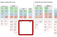
Indi Young is one of the founders of Adaptive Path, the same company Jeffrey Veen had been working for before Google. Recently she had left AP to focus on her book about mental models. What is the mental model? This is another tool in your user experience tool belt, next to personas or wireframes. Below is a sample model, taken from J. Veen’s presentation.

It’s a two folded graph. The top part shows boxes representing user needs. This data could be gathered in many ways: from interviews, call center recordings, usability testing etc. It’s important that it comes from users and shows their language instead of technical jargon. Boxes above the fold create mental groups (or towers – pretty obvious analogy when you look at the graph). Groups create mental spaces. Below the fold are the means to support user needs.
What are the advantages of using mental models? They make clear which user needs are sufficiently supported and which are not. Mental models could be useful when new features are planned, as they help to resolve the eternal argument: “what do users want?”
The presentation ended with the small pitch for Young’s book.
“Designing User Interfaces: Details Make the Difference” by Dan Rubin
Dan Rubin turned out to be a great, witty showman. His presentation was very much a “design for engineers” course – probably that was the reason I enjoyed it so much :). He gave practical tips on how to use hardly visible details to improve the design. It’s hard to pinpoint these details on the finished website, but they certainly add up to the feel of the site.
He mentioned several techniques for different design areas.
Proportion
- Create patterns for margins and paddings. Rubin showed the new cnn.com design where the “rule of 6” is applied and each margin is either 6, 12 or 18 pixels wide. He also used an obvious counter example. However, even the latter site could be improved by applying similar rules and Rubin demonstrated it with a quick compo.
Typography
- Use relative text sizes. You could follow the rule of 5 where text size for any element is a multiple of 5: 5, 10, 15.
- Adjust range kerning (or
letter-spacingin CSS syntax) of headings. Usually it makes sense to use 1px negative margin for large fonts. - Avoid widows. Currently it means inserting additional . I’d love to have a CSS solution for this.
Texture
- Reality is rarely smooth. Applying light texture to the design could give it a more natural feel.
- A quick way to create a simple texture effect is blending one layer with the second, filled with noise. Similar technique was used on My Mile Marker to give the header a more “asphalt” look.
Tactile effects
- Interesting lighting effect can be created by stretching a 1-pixel edge from a photo and blending the resulting layer with another color layer.
- “Invisible” bevels are another way to create tangible look. Rubin gave an example of Mint and its use of bevels.
- Borders and lines can look more natural when combined with blending, as can be seen on Livtopia. To make color changes easier you can put black and white lines on separate layers and blend them with the rest, instead of applying color directly to the lines.
All examples can be found in Dan’s slides.
“Professional Front-End Engineering” by Nate Koechley
Nate is a senior front-end developer at Yahoo! I’m a big fan of his presentations, filled with juicy technical details. This one was no different.
In the beginning he showed how the importance of the front-end engineering has changed during the last years. His own company is a good example. In 2001 Yahoo! had hired the first fron-end engineer. Now it has 700 of them. With more complicated websites and applications online businesses rely on the front-end as much as on the back-end part. Additionally, as Douglas Crockford put it, browsers are the “most hostile programming environment”. Anybody struggling with IE6 will surely confirm this.
Koechley listed what he believes are the principles of the professional front-end engineering. Each principle was accompanied by techniques.
- Availability. It doesn’t mean that every browser should display pages exactly the same way. Yahoo! uses graded browsers support instead.
- Openness, achieved by progressive enhancement.
- Richness – providing much, but not too much.
- Stability – prepare for the future.
Nate shared a lot of practical tips for different areas of front-end engineering.
HTML
- Learn it through. There’s a lot of rarely used but useful elements and attributes. Do you know every one? You should.
- Aim for performance when constructing HTML source.
CSS
- Focus on the left side: use precise selectors.
- Always think about maintainability.
JavaScript
- Quality. Use JSlint, profiling, and minimize touch points with vendor code. The last thing not only makes code maintenance easier, but also let browsers evolve faster. Koechley also mentioned unit testing. Apparently, all the major libraries (YUI, dojo, jQuery and Prototype) now have testing modules. For me it’s the sign that JS is really getting mature. However, it’s doesn’t imply that everybody actually writes unit tests. <guilt>I don’t</guilt>.
- Security. This is still the underestimated topic. The general rule is to never trust content from the client side. Koechly recommended watching the progress of AdSafe and Caja projects.
Accessibility
- Watch ARIA.
- Use decoupled events, so any device can listen to your events.
Internationalization
- Serve all CSS and JS in UTF-8.
Performance
This is Koechly’s pet subject, so it was no surprise that he had a lot to say. However, his advice was taken from Yahoo’s performance best practices, so I just recommend reading them. It’s worth it.
Final words were a bit high-flown, but definitely right: always show stubborn empathy for your users.
“Communicating best practices”
This was a panel led by Paul Boag, including Rachel Andrew, Patrick Lauke, Murray Rowan (former head of European Web Development at Yahoo!).
Introducing web standards and usability-driven design to the management or the clients is a real challenge. I already faced it, so I was eager to hear some tips.
One advice from the panelist is obvious but requires empathy. When talking to your managers focus on business value and avoid tech-talk. Talk money, effort and user needs. Show the consequences of good and bad practices.
One of the panelists claimed that standard-based redesigns will last, as opposed to a mixture of content and presentation. In my opinion this particular point still needs a reality check ;).
Sometimes it’s possible to just follow the right path without asking for permission. I find it to be true in companies when developers are trusted by managers (I’m lucky to be speaking from my own experience). Murray Rowan made a good point saying that you shouldn’t hire people who add up to the problem, eg. are not used to web standards or usability-driven process.
There were a lot of tips on how to position yourself as an expert and thus have more impact:
- Do the homework and know your stuff.
- Don’t be too picky – focus on battles worth fighting.
- If the managers push for timelines, fight for a promise of later quality iteration and enforce it.
- When you work for a customer forcing you to do something you believe is wrong, you can ask for removing your name from the website. It can make the client think.
Hot Topics
Both days of the conference ended with Hot Topics panels. The first one was more focused on design, the second – on front-end engineering. Here are some highlights from both panels.
Work between designers and developers.
Jeff Veen noticed from his Google experience that it’s impossible to have the same amount of control over front-end people as over programmers. It’s even harder with the designers. Forcing them to follow practices common for developers (like daily stand-up meetings or checking .psd files to source code repository) can make them mad.
Andy Clarke (a designer) mentioned how ridiculous it was for him to participate in the morning stand-up meetings. How a designer can refer his daily work? “I was thinking about tabs”?
It doesn’t mean that it’s impossible to work with designers in a team. The panelist talked very positively about Campfire as a tool of collaboration. As opposed to source control tools or bug tracking system.
What clients want?
Andy Clarke said it’s a strong warning sign when a potential client wants a “Web 2.0 website”. Well, it’s cool to be able to pick clients.
Front-end
It’s still hard to define the front-end part of web development. However, it was welcomed with a loud applause that front-end nowadays is at least as hard as the back-end (Simon Willison). CSS knowledge seems to be the best common denominator for the professionals in this area.
Switching from corporate job to freelance
Simon Willison and Jonathan Snook, booth freelancers at the moment, shared a few tips. A good idea is to share an office space to avoid anti-social effects of working from home. They agreed that writing a blog is one of the best ways to get clients. The sooner you start it, the better. A 5-year-old blog should be a solid preparation before going to freelance.
Checked.
helen
great:)
Rafal Zrobecki
Hi there, some podcasts are now available from that conference – check this out – http://www.vivabit.com/atmedia2008/london/blog/
It was great to meet you Mr. Szafranek :) I am looking forward to see you at the ajax conference in september!